New brand image for LAUDA
An important milestone for the future
LAUDA is a global leader in precision temperature control in medical technology, material testing, bio-technology, laboratories, research and production. A new corporate design is intended to portray the uncompromising quality and comprehensive expertise of LAUDA all over the world. The company image has been completely overhauled by Munich branding agency Martin et Karczinski adequately to represent LAUDA’s market position, reinforced by outstanding innovation.
New brand image for LAUDA
LAUDA
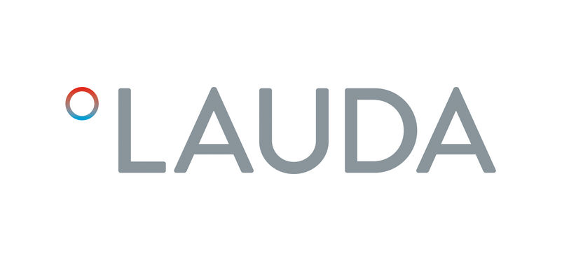
The new LAUDA logo
LAUDA
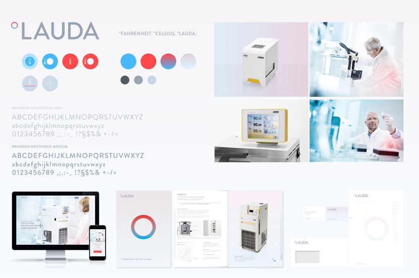
The new LAUDA brand image
LAUDA
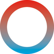
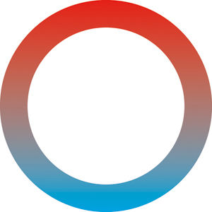
The core of the new brand identity is the recently developed word/image logo, together with a new claim. The logo consists of the degree character (°) used internationally for temperature measurements in a red/blue color gradient. The core expertise of the company “Development of closed systems for controlling cold and hot temperatures” is imparted visually and intelligently, and is easy to understand. The new claim, “°FAHRENHEIT. °CELSIUS. °LAUDA.” also reinforces this. In a timeless and confident manner, the message conveys that LAUDA is the partner for precision temperature control thermostating.
In order to ensure a degree of consistency and integrity in all company communication, the new color scheme and visual language are heavily influenced by the word/image logo. Accents in the primary colors of red and blue create an unmistakable tonality for the LAUDA brand, while relevant image content is emphasized with a sharp focus. The new visual language reinforces the brand values: “focused” and “comprehensible”. Noble ice gray in the typography creates a consistent, progressive style.
The new LAUDA corporate design is intended to lay the foundations for a successful future.

Other news from the department business & finance